In recent years, the Bitcoin logo has experienced a major boost in recognition. His icon has even been added to the Google keyboard! But the curious thing is that, unlike many renowned logos, the Bitcoin emblem has no marketing teams, luminous designers or multi-million budgets standing behind it.

Who created the very first Bitcoin logo? How has it changed ever since? What is its symbolic meaning? This article follows the evolution of the distinguished crypto symbol. Buckle up! Let’s embark on an exciting crypto journey!
- The first Bitcoin logo
- The history of the Bitcoin logo
- Bitcoin logo elements: the meaning of the letter “B”, proportions & orange background
- The Bitcoin logo copyright
- Conclusion
The first Bitcoin logo
The idea of creating a digital currency became a hot topic in the 1980s. Finance enthusiasts were taken by the idea of speedy and anonymous payments. However, before Bitcoin entered the stage in the 2000s, the world had seen several prototypes of crypto currencies. However, neither of those had managed to gain a solid foothold in the market.
In August of 2008, in the heat of the financial crisis, an anonymous user registered the bitcoin.org domain. In October, the cryptography website metzdowd.com published an article entitled “Bitcoin: A Peer-to-Peer Electronic Cash System” that talked about a new decentralized digital currency and its modus operandi. By the way, the piece was authored by Satoshi Nakamoto whose identity remains unknown to this day.
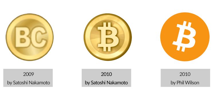
Several months later, in January of 2009, Nakamoto presented the first Bitcoin logo. It resembled a gold coin with the letters “BC” engraved on it.

Bitcoin enthusiasts believe that the logo was inspired by the design concept of skeuomorphism that was making waves back in the 2000s. Skeuomorphism refers to digital objects that look exactly like their physical prototypes. A textbook example of this design philosophy is the operating system on the first iPhone. As for Bitcoin, the idea was to make the logo look like real-life money and evoke associations with digital gold.
The history of the Bitcoin logo
In the first two years of its existence, the Bitcoin emblem lived through two transformations. The latest version of the Bitcoin logo has remained unchanged for a decade now, becoming more popular with each year.
First redesign of the Bitcoin logo: February 2010
As the Bitcointalk crypto forum was growing, its users started to come up with improvements to the Bitcoin design. While some crypto enthusiasts suggested using the letters “BTC”, others looked to the Thai Baht (฿) for inspiration. Some users were opposed to any borrowings and supported the idea of creating a unique Bitcoin emblem from scratch.
In February of 2010, Satoshi came up with a renewed Bitcoin logo design. The gold coin survived the transformation but now it only had one letter “B”, instead of “BC”. The letter was pierced by two vertical lines which were familiar to the audience from some fiat currencies, e.g. the US dollar.

Second redesign of the Bitcoin logo: November 2010
However, the forum users were not happy with the changes. In November of 2010, a user under the nickname Bitboy posted his version of the Bitcoin logo. The flat design featured a white letter “B” that was slightly tilted to the right. The graphic was contrasted with a vibrant orange background.

This time, the Bitcointalk audience welcomed the improvements that, according to users, gave the logo a modern and edgy look. “The best Bitcoin logo I’ve ever seen,” wrote one of the forum participants.
Alternative Bitcoin logo: April 2014
Despite the successful logo revamp, a group of activists that referred to themselves as “Bitcoin symbol” argued that what the new cryptocurrency needed was not a logo, but a sign. Let’s look into how they backed up their idea.
- Bitcoin is not a brand but a currency, hence it needs its own sign (like $, € or ¥), not a logo.
- Like fiat currencies, Bitcoin can use a Unicode character which is easily reproduced in different fonts and across different surfaces. A graphic logo doesn’t possess these qualities.
In April of 2014, the activists suggested using the letter “Ƀ” as a new Bitcoin sign. Although a number of Bitcoin startups were fast to include the graphic in their logos, it failed to become ubiquitous.

With the rising popularity of the Bitcoin logo, the Bitcoin Symbol movement lost traction. The logo became so deeply incorporated into people’s lives that Google added Bitcoin to its keyboard (the iOS version only) and Twitter introduced a Bitcoin emoji to complement the #bitcoin hashtag.
Bitcoin logo elements: the meaning of the letter “B”, proportions & orange background
Several years after the Bitcoin logo came to be, Phil Wilson — who claimed to be the person behind the nickname “Bitboy” — published an article that talked about the symbolism of the original Bitcoin emblem. Let’s scrutinize the design techniques that make up the celebrated crypto design and see how you can use them in a logo of your own.

Shape
Before deciding in favor of a circle, the Bitcoin logo creator studied geometry psychology. Other viable options included a square and a zigzag. Since the human brain is quick to notice any potentially dangerous movement, angular geometric forms are particularly good at catching our attention.
Nonetheless, to avoid negative associations, Wilson eventually went with a circle. Let’s see why the geometric shape works great in this case.
- A circle stands for openness and friendliness.
- A circle is an uninterrupted line that conveys the idea of continuity.
- Two circles merge into the infinity symbol.
- A circle is associated with a coin, i.e. money.
What’s interesting, in 2010 Bitboy admitted that he had drawn inspiration from the Visa and Mastercard logo designs: “The irony is as much as I hate Mxxxxx and Vxxx, it is all about perception when it comes to consumer confidence and behavior.”
Takeaway. When choosing the right shape for your logo, make sure it embodies the connotations and meanings you want to convey through your design.
Letter “B”
“B” is not just the first letter in the word “Bitcoin”. If you rotate it to the side, it’ll start looking like the digit 8. This digit is filled with a deep symbolism.
- The size of each block in the BTC logo design is proportionate to 12.5 (100 divided by 8).
- The letter “B” is tilted at a 14-degree angle. (This number was obtained from 12.5 as a result of complex calculations.) The tilt symbolizes the blockchain’s constant movement towards creating a better future.
Takeaway. An icon is the key element of any logo. By choosing an icon that has meaning, you make it easier for your potential customers to memorize and recognize it later.
Vertical lines
The design element that distinguishes the dollar sign ($) from many other currencies is a vertical line that pierces it from top to bottom. A similar line — but filled with new meanings — can be seen in the Bitcoin logo.
- Wilson drew not one but two vertical lines. This way, Bitcoin started to resemble the $ sign as portrayed in Disney’s Scrooge McDuck cartoons.
- The vertical lines are thinner than other lines that make up “B” and are only seen above and below the letter. It almost looks like Bitcoin crushed the dollar, smashing it into the ground. This is a great visual metaphor for the new-age digital currency replacing a traditional one.
Takeaway. It might be a nice strategy to build up on brand identities used by your competitors. This way, you’ll be able to carve out a unique path for your business and make a strong statement that will resonate with your audience.
Font
The letter “B” is written with the Trebuchet font. Wilson admitted that he had always liked that word and how it was used in the “Microsoft Age of Empires” video game. On top of that, a sans serif font is an ideal solution for digital use.
There’s also a full version of the logo that features the word “bitcoin” written with black lowercase letters without serifs. This is Ubuntu Bold Italic, the font created precisely for Ubuntu which is a free operating software with an open source code.
Minimalist and modern, the typeface portrays Ubuntu’s key qualities which are also characteristic of Bitcoin, such as accuracy, reliability, and freedom.
Takeaway. When choosing the best font for your logo, make sure it’ll work well across different contexts. Also, think about what emotions and feelings it evokes.
Colors
When it comes to colors, the Bitcoin logo heavily relies on a vibrant orange hue. We’ve summed up the reasons behind Wilson’s choice of this particular shade.
- Practicality. Wilson wanted to make sure the Bitcoin logo would display well across both digital and printed surfaces. To pick a shade that met that requirement, Wilson revolved to the CMYK color model which is commonly used in printing.
- Functionality. Compared to other popular colors, orange excels at making the logo visible from a distance, instantly memorable, and easy to reproduce.
- Psychology. This particular hue is “very close to the typical warm shade of orange that many people perceive as safe.” Plus, the color evokes associations with gold.

In the Bitcoin logo, orange is complemented with two other colors. The letter “B” is white, and the word “bitcoin” is black. In addition to creating a visually appealing contrast with orange, these shades are synonymous with nobility, authority, and high value.
Takeaway. Colors in your logo must match each other, display well both on screen and in print, and send the right message to your audience.
The Bitcoin logo copyright
The official Bitcoin logo is protected by the Creative Commons license, meaning it’s free for both commercial and personal use.
A recent study revealed that out of the CoinMarketCap top 500 logos,13% imitated the Bitcoin picture by using initial letters crossed with lines or gaps.
Conclusion
Nowadays, the Bitcoin logo is one of the most recognizable graphic signs in the blockchain universe. Let’s sum up the vital characteristics that account for its tremendous success.
- Simplicity. The Bitcoin logo contains a bunch of meanings while being concise and clean.
- Uniqueness. While the logo is somewhat reminiscent of familiar fiat currency signs, it’s a standalone graphic with a distinguished personality.
- Versatility. The image scales up and down nicely, which makes it ideal for different uses. Plus, it looks great both on screen and in print.
- Timelessness. Although created more than 12 years ago, the Bitcoin logo still looks relevant and meaningful.
The above-mentioned characteristics should make your logo checklist. The good news is that you don’t have to spend years working on an ideal emblem for your brand, like the Bitcoin story suggests. Use the ZenBusiness Logo Generator to create a unique and edgy design in just a couple of minutes!

